I got a new theme again. This is the 3rd time in 4 years that I’ve updated my WordPress theme. I like blogging about it every time I design it because my blog is like a journal of my life and I like to keep track of things like this. Here’s the post for my redesign in 2014 and here’s the post for the redesign in 2013. You can keep reading, though, because I put all the screenshots from those posts at the bottom!
My last theme was more high maintenance than a Disney Princess and it was always stressing me out. (The featured image is the wrong size! If it’s off by 2px it looks like crap! WHY does it keep adding random lines to things?!) I got a kick out of going over what my blog designs have looked like through the years and I thought I’d share.
EXHIBIT 1 – BUTTERFLIES AND….INK
I’m not sure what my logic was behind this design. Let’s have ink blotches because books! And since that’s kind of grungy and ugly we’ll add a pretty butterfly! Looks nice doesn’t it?
EXHIBIT 2 – MORE COLOR! MORE BRUSHES! MORE THE THINGS!
I got tired of the black and white, so I downloaded every photoshop brush known to man and came up with this thing.
This is where my owl came in. I ADORED him. He felt like my mascot and I used him for all my social media buttons. Of all the things to go from my designs, he’s the only thing I miss. :(
The Jane Austen font is ok. Making this banner took every photoshop and computer skill I possessed. I had to take a screen shot of my theme and add things on top of it to make it seem like my header went out of the designated header area. I was rather proud of myself. But even then I knew I kept adding layers and layers of brushes because I thought it looking good was just one more photoshop layer away….
EXHIBIT 3 – JESSICA HIRES PROFESSIONAL HELP
I decided to get a new Genesis theme called Streamline because my free theme was very hard to customize the way I wanted to. You had to know CSS to change anything in my free WordPress theme so I paid $80 and got a new one. The ironic thing was I had to learn way more CSS than I had planned because it didn’t work out of the box like I wanted to. But I was determined to get it to look exactly the way I wanted because I spent so much money on it!
I loved the theme but I didn’t even know where to start with a header design. So I hired Ashley from Creative Whim and I LOVED IT. I kept it the longest of all my blog designs – about 1 1/2 years.
EXHIBIT 4 – SIMPLE AND FEMININE
I was tired of the dark background so I was determined to make a header with an all white background so my theme background didn’t have to be black anymore. I went through many, many bad designs before I made this one.
No really. The others were bad. Super super bad.
YOU WANT TO SEE THEM DON’T YOU.
Floating Feathers – This one isn’t terrible. I love the fonts. In fact, the pink font ended up being the one that says “Books” in my new banner. But the feathers are just floating there with no purpose and it just looks weird. Like, did a bird explode? POOF.
Centered – This one is hard to read and the feather in the background is so covered up that you can’t even really tell its a feather.
Outlined – I’m not sure why I kept trying to get the feather in the background. You can’t tell it’s a feather and you can’t read the words on top of it without an outline which I didn’t like.
Sucks – This one is titled “Feather Banner Sucks.” Yeah, I don’t need much more explanation than that.
EXHIBIT 5 – NEW THEME FOR A NEW HEADER
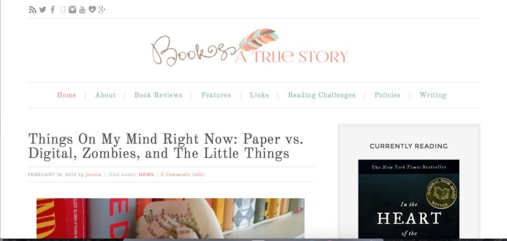
Here it is! The final design!
And here’s the screenshots from my designs in the past. It’s fun to see how blog designs change over time. Hope you enjoyed!
- June 2012
- March 2013
- September 2014


 My name is Jessica. I love to read Young Adult and classic literature. I’ve been a book blogger for six years and I haven’t gotten tired of it yet. I’m a very curious reader. Writing about all the questions and thoughts I had while reading a book is the best hobby ever.
I love looking at how people’s designs changed over time! I have gone through a lot of changes myself, but sadly I didn’t keep record of them and I really should have!!
I really like your final header – very cure! And I also like the font you used and the general layout :-)
I think I discovered you and your blog during Exhibit 3. I loved that owl too. Your designs are so fun. I can’t wait to see how your blog evolves in the future.
Aww, you know I really have loved all your designs! None of these above are bad at all, but I can understand the feeling about being a perfectionist about your own work. Honestly, even the ones you describe as looking bad are super impressive to me! I wish I had your skillz, heh
I remember the owl. He was cute! I like the new header though. I love that you finally used the feather as a quill. Very fun!
I like changing my theme a lot too. I get bored easily with my current one. And, I’m constantly tweaking it–looking for the right font, making sure the spacing is right, coloring, etc. So, I know exactly how you feel. I really love your new theme. I love how light it is. I’m glad you kept the colors and the feather from the previous one, but I understand about making sure the underlying Genesis theme is easy to use. Good job!
PS–This kind of makes me want to showcase all my themes, but I think I have 9 or 10 and don’t have all of them anymore…
I love your blog design. So so so beautiful. I am thinking about changing mine too but I don’t know what I want just yet. And I think I have to go and redo/re-format old post with the new design I pick.
I’m just impressed that you know how to make a banner AND use PhotoShop. That makes you a genius in my book! Love the new banner — it’s elegant and eye-catching in its simplicity.