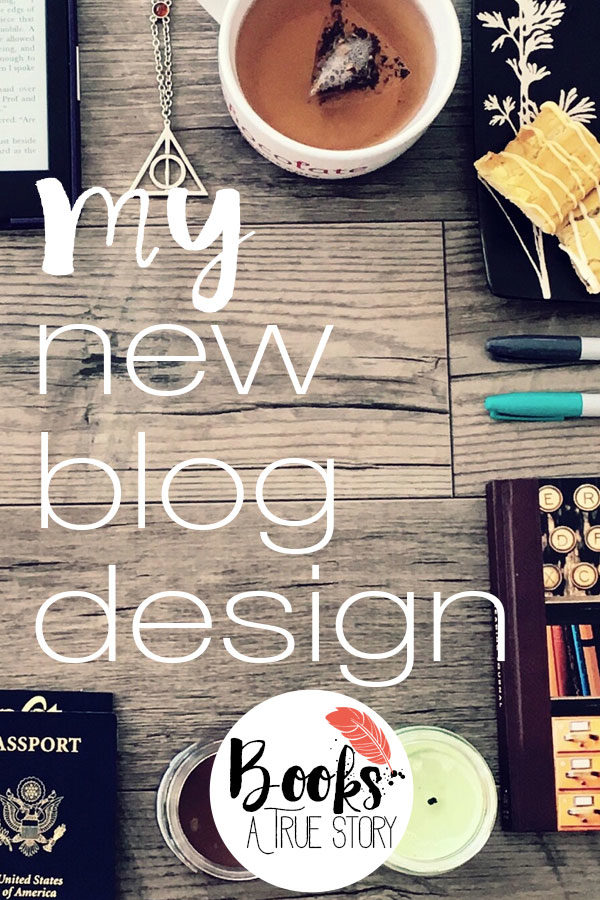
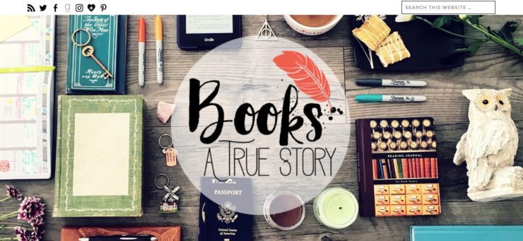
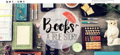
A few weeks ago, I talked about how I made blogging work for me again and part of that was doing more on Instagram. I wanted to reflect a new photography focus on my blog design so I decided to update my blog theme. I put a huge photo in the header that I took myself full of books and things I love.
Plus it’s been over a year since I’ve changed my design and after writing this post about how my design has changed over the years, I noticed that my design changed every year almost like clockwork. I didn’t do that on purpose. In fact, every time I redo my blog design my husband groans at the money I spend so I promise I will never change it again. My blog redesigns often involve buying new themes and they can cost anywhere from $30-$50. I think it’s time to stop the lies. I like changing my design periodically. :) BUT this design was relatively cheap since all I purchased were the fonts for my logo which only cost $12. I took the new header photo myself so it was free :) I was able to keep my theme and just tweak the code to the way I wanted it. See?! Cheap!
Speaking of tweaking code, if you are reading this post from a laptop/desktop, you’ll notice that my header background image stays in place while my logo scrolls over the top. This is called a parallax scrolling effect which creates an illusion of 3D depth and I got the code from here. JUST FYI – this code is very buggy on mobile devices, especially iOS devices. I had to change the code for my media queries to get it to look right on smartphones. Media queries are a pain in the butt. It’s possible, but it takes a lot of custom coding. Just want you to be warned before you jump in :)
So here’s the code I did in case you want to use it:
/* custom fixed scrolling background header */
.site-header {
/* The background image */
background-image: url(“http://www.booksatruestory.com/wp-content/uploads/2016/05/headerimage”);
/* Set a specified height, or the minimum height for the background image */
height: 600px;
/* Set background image to fixed (don’t scroll along with the page) */
background-attachment: fixed;
/* Center the background image */
background-position: center;
/* Set the background image to no repeat */
background-repeat: no-repeat;
/* Scale the background image to be as large as possible */
background-size: cover;
}
Other things I added:
- A home page. I love it!! My favorite part is the Instagram photos featured there.
- Instagram widgets on my homepage and sidebar. I use the Instagram Feed plugin and it’s awesome.
- A new logo. I kept the feather, but I changed the color and, like I said, I got new fonts. I also added the ink splatter and I love everything about it!

- A new color scheme. I have a reddish-orange instead of pink and a teal instead of light green
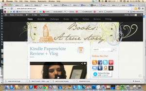
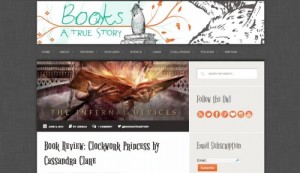
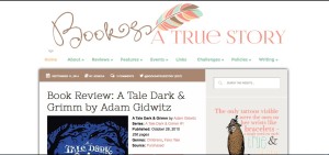
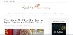
Just for fun, here’s a gallery of my past blog designs so you can see how it’s changed :)
- June 2012
- March 2013
- September 2014
- February 2015
- June 2016


 My name is Jessica. I love to read Young Adult and classic literature. I’ve been a book blogger for six years and I haven’t gotten tired of it yet. I’m a very curious reader. Writing about all the questions and thoughts I had while reading a book is the best hobby ever.
I love it! What a great idea to take your own picture! I’m impressed with your coding skills. I know nothing about those things. Which is why my blog design is so boring.
I love the new design as I said on Twitter. I’m glad you were able to get your old theme to work for you. My husband rolls his eyes at me every time I want to change my theme and I change mine more than once a year, lol.
I’ve been wondering what this font is. I’ve seen it around a lot lately and I love it. I don’t want to use it for my blog, I’m just curious what it is. Will you tell me? Pretty please! :D
Do you mean the fonts in my logo? They are called billow and adrift.
Yep, your logo. Sorry I didn’t make that clear, lol.
Ps I got these fonts on etsy in a bundle. They are $12 each on creative market. So if you get them look them up on etsy. I’ve been seeing handwritten fonts every where too and I love them. :)
Thanks for letting me know. I’ll check it out. :D
It looks great! I agree the Instagram feed is a nice feature.
Thanks :)
😱❤️!
I’ve been meaning to update mine for sometime now but I’ll probably pay for one. I wish the girl who did mine was still making blog designs. She stopped shortly after I got mine. :( Yours looks great!! I love it so much.
Aw man that’s too bad. Good designers are hard to find. I love the design you have now!
I forgot about your cute owl! I like the new look! I’m so impressed you did it yourself. Go you!
I miss him sometimes. Thanks so much!
The cover photo looks very professional! Keep up the good work.