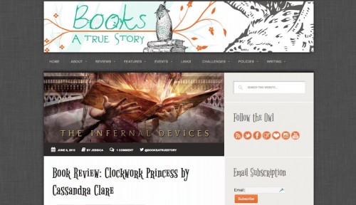
Sadly, my husband is tired of hearing about my NEW! BLOG! DESIGN! after asking him twenty million times for his opinion on my new blog badge that had only slight variations (is the feather better on the right or the left??). But that’s the beauty of the Internet. Chances are NO ONE cares about the tiny details of my redesign, but the fact that this post is public and I can write whatever the crap I want gives me the beautiful illusion that someone does care and will read this entire rambling thing.
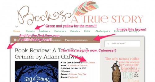
I’m so proud of my new blog design because I did it all by myself! Meaning I customized the CSS for my existing theme and made a new banner and badge. But still!! I was very proud of all the little tiny things I changed.
Let’s start from the beginning. I’ve been wanting to redesign my blog for a while now. Not because it was ugly, but, as the owner, I look at this thing all the time. It’s like furniture – its not like the couches are in a terrible place but after looking at the couch in the same place for 5 years you just want it somewhere else you know? I was just tired of the dark look. I wanted something colorful, feminine, and light.
Since I started my blog in 2011 I have always had a black colored theme. White, minimalist designs seem to be the trend now and I wanted one. But I was broke. Enter me finding these adorable feathers on Etsy when I visited the Bumbles and Fairy-Tales blog and saw her cute new design and lo there was a design credit!! The feather had all the colors and ooooh it could be like writing my blog title and then I added this cute font I found from Nose Graze and there you go. From there I went color happy (pink! mint green! dark green! light brown! gold!) and changed the color of all the things I could find.
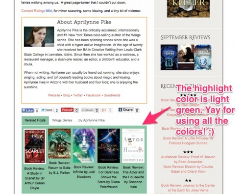
The block quote were trickier to do the colors for. I didn’t want the Related Posts and the About the Author box the same color. I wanted the book synopsis pink so that left light green, dark green and yellow for the back ground of each. Yellow was too dark and having the author box light green didn’t make it different enough … then I was hit with the idea to make the author box with a yellow border and white background. An added bonus for that was that it made it look more a part of the blog post!
AND I got to learn new things! I learned how to make my own buttons so the ones on my blog could be pink instead of orange.
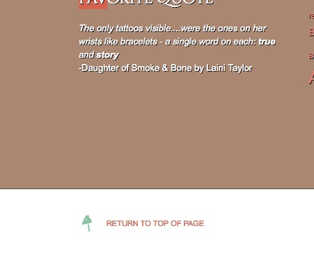
Here’s the thing about changing your design. It starts out as a new header and then you realize the links don’t match and before you know it you’ve redesigned the whole thing in two days. I even had to put a new arrow next to the return to the top link.
It took me two hours to find a cute font that you can actually read for the blog post headers that I thought matched the new style of my blog. I loved the font in my sidebar headers but it was just too hard to read so I couldn’t use it for the post titles. But I couldn’t let it go either. So I have like 4 fonts on my blog. Oh well :)
Then I had to make new star ratings and a new badge. My plugin for the social media icons didn’t have the right color pink, but to my surprise I liked the dark grey.
My new banner didn’t have my owl which has been on my blog since it started. I feel like he’s my mascot so I made a quote with him in it. It’s from Daughter of Smoke and Bone and I thought it fit with my blog title perfectly :)
The thing that took the most time was the menu. I had to change the font size, figure out how to change the sub menu indicator to the cute little double arrow and then figure out how to change the background color from black to it’s now present light gray.
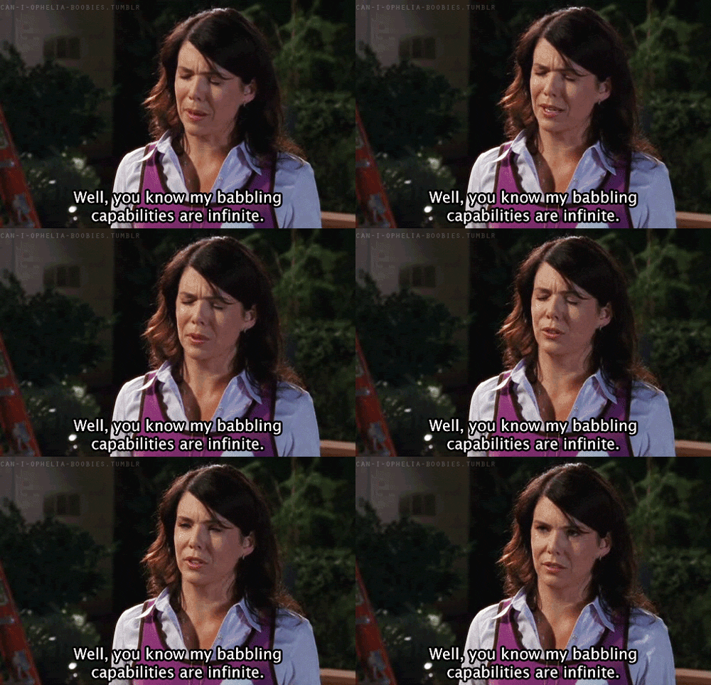
If you are speechless at my ability to ramble for 800 words about a new blog design, I have a new catch phrase for you.


 My name is Jessica. I love to read Young Adult and classic literature. I’ve been a book blogger for six years and I haven’t gotten tired of it yet. I’m a very curious reader. Writing about all the questions and thoughts I had while reading a book is the best hobby ever.
I love your new design! You did a great job. :) I’m a big fan of plenty of white space these days.
Thank you!! That means a lot coming from a talented designer like you :)
Good job! I’m always changing my blog. I’m always buying new themes and customizing them. I don’t like sticking with one theme for very long. So, I know how you feel. It’s always exciting to change your blog!
I’ve loved all the designs that you’ve done :)
Love the new design. My own blog has had a few makeovers over the past few years, but I’ve used templates. My latest one was made free for me, and I love it so much :)
I love your design too. The fireworks coming out of the book is my favorite :)
Way to go! It looks great!
Holy moly, Jessica!! Looks seriously gorgeous, can’t believe you did it all on your own! Well, it sounds like you put a lot of work into it (and learned new things in the process), so maybe it isn’t that surprising that your hard work paid off! I wish I could do this. Soooo in love with your colour scheme and quote feature and yayyy you still have your owl!!
Loving the new design so much! Great job!
I love this so much!! It is a lot brighter.. makes it more open. I wish I would’ve brightened up the look on my blog but oh well. Great job too for doing this all on your own.
1) Props to you for doing this ALL BY YOURSELF!
2) I love owls. So much. And when I didn’t want to be overwhelmingly owl-ish, I too, chose feathers. I love love love this look and the colors and the big feather and everything. GORGEOUS.
3) Your rambling was awesome! ;D
4) So is your name. ;)
It looks so pretty! This is the first time I stop by your blog and I like how everything looks. I hope to stick around and see what else you do to it, but believe me, it looks GREAT. I wish my blog looked as good as yours. :)
Wow, I love this design! Especially the feather. And the QUOTE…so perfect :) You did a really great job!!
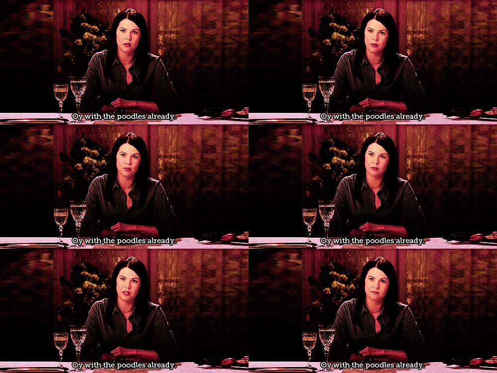
I love gilmore girls =) I LOLed at your choice of scenes. my fave is the poodles one ;)
You did a fabulous job on your redesign. I know what you mean, I redid mine. It started with the header and blog button and turned into me obsessing over it for two days. Mine is simple but I am proud of what I did and there’s a greater sense of accomplishment doing it yourself. Congrats!